Lustre, Deep Matte or Metallic: Picking Lab Paper for Portraits
Paper surface decides how skin, hair and black clothing render on a wall. A working comparison of lustre, deep matte and metallic stocks, with the room conditions that make each one succeed or fail.
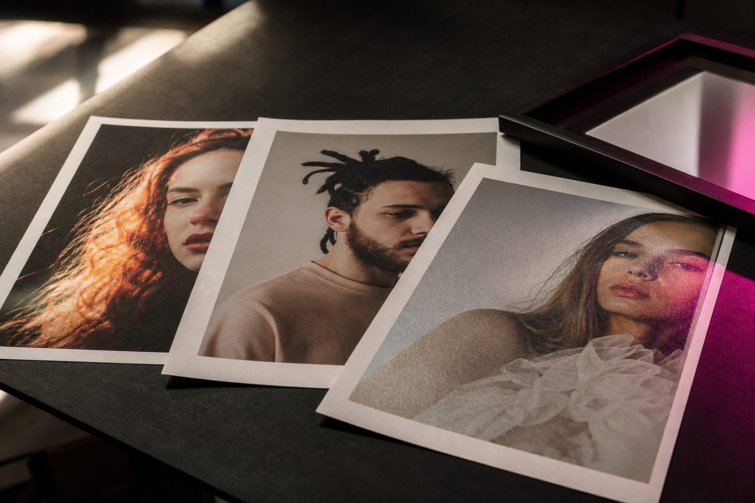
How silver halide lab papers are made and coated
The backbone of most lab-printed portrait work remains silver halide paper. These papers start as resin-coated bases, giving structure and stiffness. During manufacture, the base is layered with a light-sensitive emulsion containing silver salts. When exposed to light in a lab printer and processed with chemicals, these salts form the visible image.
The surface coating is the final touch. Labs apply different finishes, lustre, matte, metallic, by varying the outermost layer. This coating controls reflectivity, texture, and the way the print interacts with light in the client's home. Unlike inkjet prints, silver halide papers lock the image beneath a smooth or textured barrier, which protects from minor scratches and fingerprints.
Production runs for these papers are highly standardized. This consistency ensures that prints from different orders match when placed side by side, a key concern for wall displays or repeat orders. The coating process also guards against yellowing and fading, especially when prints are displayed under glass.
Keep reading: Cropping Mistakes That Ruin Wall Portraits at 16x20 and Up
Surface texture and what it does to skin tone and shadow detail
Every surface finish changes how light moves across the print. Texture diffuses glare and softens contrast, while a glossier surface heightens both sharpness and depth. For portraits, the chosen texture determines how skin, fabric, and hair appear under real-world lighting.
A smooth, glossy paper can exaggerate both highlights and minor imperfections in skin. Fine lines, pores, and uneven makeup become more visible. On the other hand, a textured surface, like lustre or deep matte, scatters light, minimizing surface shine and giving skin a softer look. This can mask blemishes and create a more flattering tone, especially for seniors or children.
Shadow detail is another casualty or beneficiary of surface choice. Matte surfaces can mute deep blacks, sometimes causing detail to disappear in the darkest areas. Glossy or metallic finishes, in contrast, show more gradation in shadows but can exaggerate contrast and color shifts. The effect is especially noticeable in black clothing and dark backgrounds, where surface reflection and coating absorb or reflect ambient light differently.
Lustre as the safe default, and the two jobs it handles badly
Lustre is the go-to paper for most studio portrait orders. It sits comfortably between glossy and matte, offering a semi-reflective sheen with a fine, pebbled texture. This finish gives skin a natural glow, holds detail in hair, and avoids the mirror-like reflections of full gloss.
The texture hides minor surface scratches and fingerprints, making it practical for unframed prints or quick hand-offs during in-person sales. Lustre also works well for color consistency, displaying a wide range of skin tones without heavy color casts.
However, lustre paper stumbles in two areas. First, it does not offer truly deep, velvety blacks. Black clothing can look slightly washed out, especially in high-contrast lighting. Second, lustre fails in locations with direct, harsh lighting, such as rooms with large south-facing windows or recessed ceiling spots. In these conditions, the slightly glossy finish can produce distracting glare, particularly on larger prints or those hung without glass.
Keep reading: Sales Tax on Portrait Sessions and Prints: How States Decide
Deep matte and fine art stocks: black density, cost and handling
Velvety blacks and soft gradations
Deep matte and fine art papers offer a completely non-reflective surface. This finish excels at suppressing glare and producing a painterly look, with gentle transitions from highlight to shadow. Skin appears smooth, and backgrounds take on a subtle, elegant tone.
True deep matte silver halide papers, and high-end inkjet fine art stocks, both trade away some black density for this softness. Blacks appear less deep than on gloss or metallic, so rich black tuxedos or dark hair may lack punch. In brightly lit rooms, the absence of reflection is an advantage, but fine detail in shadow areas can be harder to distinguish.
Handling and cost considerations
Matte papers show fingerprints, scuffs, and even traces of oil from skin more readily than lustre or metallic surfaces. Handling with gloves is a must, especially before framing. The cost per print for true deep matte or fine art inkjet stocks often runs higher than standard lustre, reflecting both material expense and lower yields during production. Replacement costs for damaged prints can add up if clients handle them before framing.
Matte prints are the clear favorite for classic black-and-white headshots, high-key newborn sessions, and fine art-inspired family portraits. They also suit installations where the client's walls receive lots of daylight or overhead track lighting.
Metallic and pearl: the subjects it flatters and the ones it wrecks
Extra punch for the right images
Metallic and pearl papers are coated with mica or other reflective particles, giving the surface a subtle shimmer. This catch-the-eye effect works best with high-contrast subjects, such as dance, athletic portraits, or prom sessions with sequined dresses. Metallic finishes intensify colors and deepen blacks, making jewelry, water, and saturated fabrics pop.
Clients often respond with excitement when first seeing metallic prints. The novelty factor is strong, and the finish resists fingerprints and surface damage as well as lustre.
Subjects that suffer on metallic
Not every portrait benefits from a metallic treatment. Senior headshots, family groupings, and wedding formals can look unnatural. The shimmering effect often exaggerates skin imperfections and turns subtle highlights into distracting hotspots. Skin tones may shift warmer or cooler, depending on the lab's chemistry and the ambient light in the viewing room.
Metallic papers also create strong reflections. In rooms with mixed light sources or lots of movement, the shifting glare can make it hard to appreciate the image from every angle. For these reasons, metallic is best offered as an accent for specific images, not as a default for every client order.
See how ProofRoom handles this for photography
Framing, glazing and glare in the client's actual room
Working with glass and acrylic
The decision to frame under glass or acrylic changes the way any paper is seen. Glass protects from dust and fingerprints, but it adds another reflective surface. Standard glazing can double the risk of glare, especially for lustre and metallic prints. Non-glare or museum glass helps, but it adds cost and can slightly reduce perceived sharpness.
Clients rarely anticipate how a print will look behind glass in their home. Dark walls or strong window light can turn a glossy or semi-gloss print into a mirror. In contrast, matte prints hold up better in challenging light, though even they can lose depth when paired with poor-quality glazing.
Open display and handling
Unframed prints, or those displayed with clips or on easels, face different hazards. Lustre resists fingerprints and is less likely to show minor scuffs. Matte demands more care and suits clients who commit to immediate framing. Metallic, being robust, can handle handling but is at its worst in open display near windows.
It helps to ask clients about the intended display location before recommending a paper. A quick discussion about room lighting, wall color, and whether the print will be framed can prevent disappointment and costly remakes.
Building a three paper menu a client can choose from in one minute
Most clients do not want a technical lesson. They need clear choices, each with a tangible benefit and one watch-out. A concise menu with three options keeps the conversation moving and the decision easy.
- Lustre: Standard for most portraits. Good color, hides surface marks, but watch for glare in very bright rooms.
- Deep Matte: Best for soft, classic looks and high-key images. No glare, but handle carefully and expect less punch in deep blacks.
- Metallic: For images with bold colors, special effects, or standout details. Shimmer effect grabs attention but can look strange on skin.
Show each paper with one sample image, ideally matching the client's session type. If possible, offer a real print in each finish for them to touch and view under the studio's lighting. Let them hold the prints at an angle, looking for glare and shift in color or contrast. This usually answers their questions faster than any sales pitch.
Tools that combine proofing, favorites selection, and integrated print ordering make it simple to guide clients through these choices. When clients see their images rendered on different papers and can place an order in one link, decision fatigue drops and satisfaction rises.
Read also
Three more pieces from The Proof Sheet on the craft, the pricing and the paperwork behind a portrait studio.
Cropping Mistakes That Ruin Wall Portraits at 16x20 and Up
Most cropping damage happens before the shutter fires. Here are the framing, aspect ratio and resolution errors that appear only after a client orders big, and how to shoot so they never do.
Sales Tax on Portrait Sessions and Prints: How States Decide
Some states tax the print, some tax the whole session, and some tax the download too. A plain reading of how state rules classify portrait work, and what changes when your lab ships the order.
Inside a Copyright Claims Board Case Over a Reused Portrait
The Copyright Claims Board hears small infringement claims without a lawyer. Walk a typical unlicensed portrait use through filing, the opt out, damages caps and the final determination.